AIR QUALITY IN MY AREA
London's air quality has improved greatly in the last 20 years. But there is still work to do. Air pollution measurements are vital to deciding what and where we need to do that work, and to help you avoid pollution.
Understanding the air quality maps
The maps use a colour-coded system to show air pollution levels compared to World Health Organization guidelines:

Air quality meets WHO guidelines for annual average air pollution. This is the target level for health protection.

Annual air pollution levels are above the 2021 WHO guidelines but below the UK standards set in 1994. These are locations where councils prioritse action for improvements.

Annual air pollution levels above the UK standards set in 1994. These areas are councils top priorities.
Note how areas near major roads typically show higher pollution levels than residential side streets, parks or green spaces. This is why councils focus monitoring and improvement efforts on traffic hotspots.

VIEW MAPS
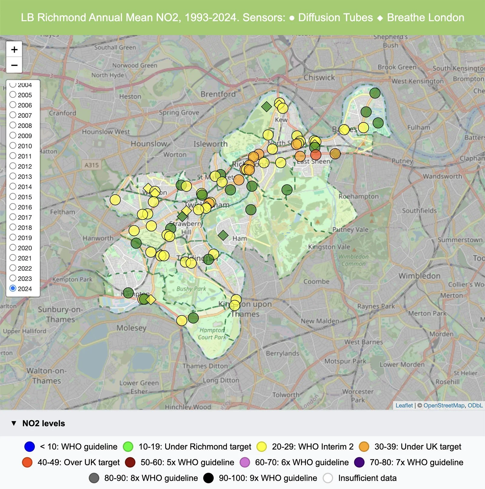

Air pollution in Richmond is at its lowest levels since measurements began in 1993. In 2024, many areas away from roads attained the Council’s 20µg/m³ target, with most other areas approaching it. Levels at Upper Richmond Road West and George St remain of most concern. We continue to work towards the WHO guideline values. You can explore our full measurements in the linked maps.
VIEW MAPS
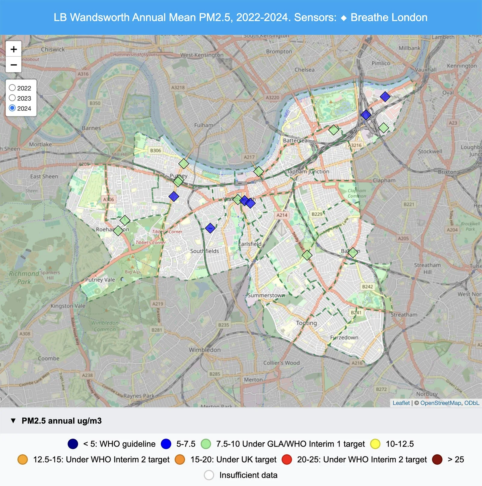
By 2024, most areas of Wandsworth achieved NO₂ levels within the Councils target of 30µg/m³, a huge improvement over historic levels in places like Putney High St. Higher levels in areas like West Hill continue to prompt further action as we work towards the WHO guideline values. You can explore our full measurements in the linked maps.
VIEW MAPS
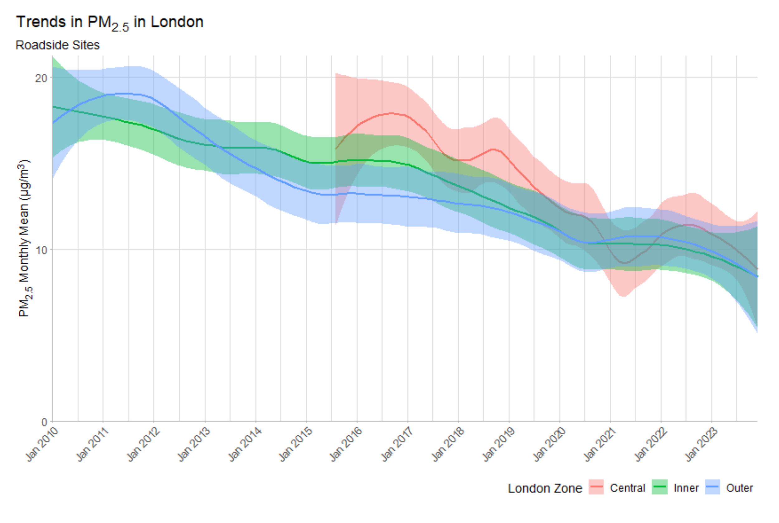
Has air quality improved over time?
The graph below shows how much annual average PM2.5 air pollution has changed in the last 15 years in London. In the early 2000s, annual levels were around 2 times higher than today, with many areas now within the UK limits and moving towards the WHO guideline. From Figure 8 of Air Quality in London 2016-2024, Greater London Authority, 2024.

Further Reading
EXTERNAL WEBSITES
You can find more information and local updates here: